Keeping up with the performance of all the queries in Google Search Console might be time-consuming. It’s also bad for your eyes.
Of course, there’re many paid tools available that create charts where you see the performance difference in time. But, we offer a free solution with the help of our Keyword N-gram Analyzer.
Comparing query performance in time (28 days, 3 months, or a custom time) helps you keep track of your overall Google Search performance. You’ll see which queries and n-grams are performing the best or where you lack impressions and traffic.
In this post, we’re going to explain how to see all your winning & losing queries and n-grams in seconds.

Step 1: Get search data from Google Search Console
You first need to fetch comparable performance data from Google Search Console (GSC).
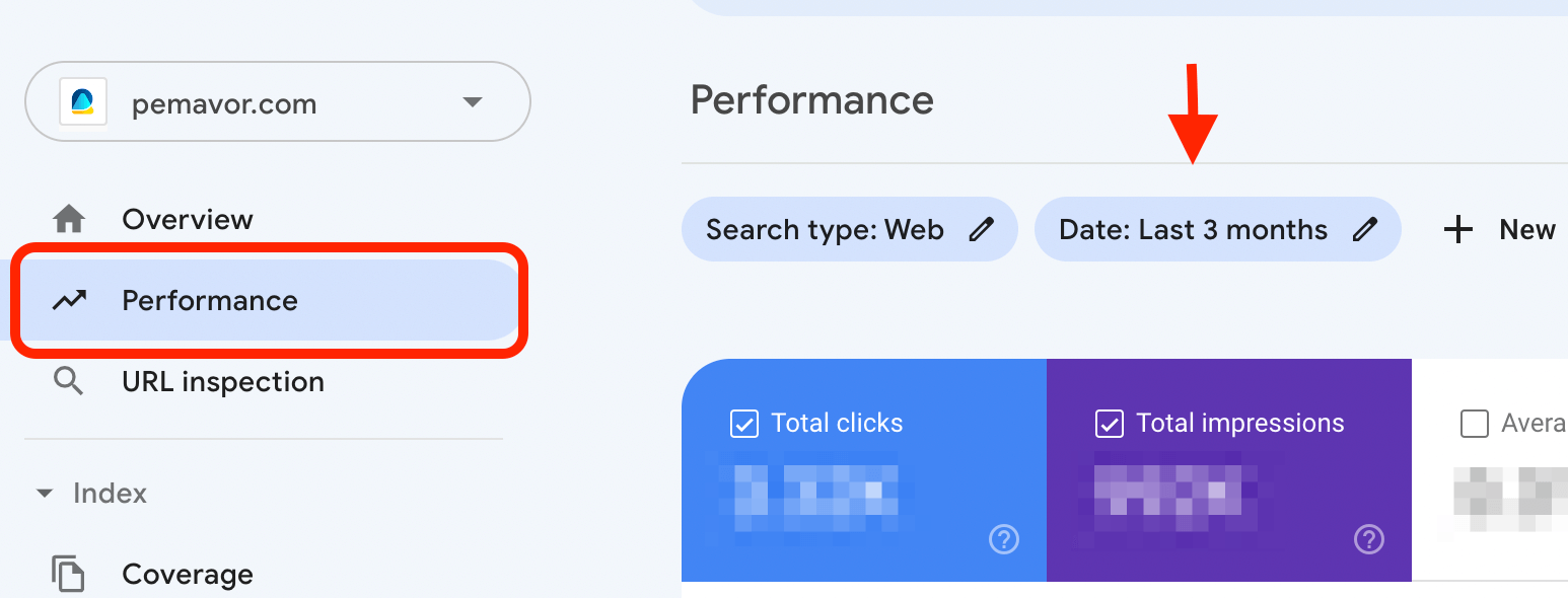
On your GSC panel, go to Performance tab. Then proceed to Date button.
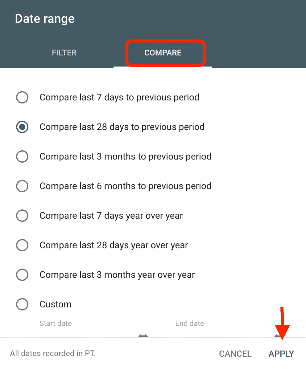
Now, choose whichever time range is the most suitable for you and click on Apply. we selected three months comparing for this tutorial.
Step 2: Export to Google Sheets and modify your data
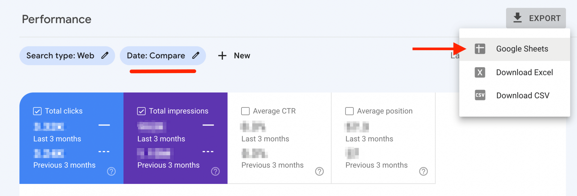
Go to Performance tab on left panel. There, you’ll see Export on right-top of your page, then click on Google Sheets. GSC data do not provide the Clicks and Impressions difference between two time periods. So, we need to manually modify the Google Sheets page, simply get rid of columns like CTR. Then, create two new columns (Click & Impression Difference) as shown below by using simple formula: B2-C2 and E2-F2
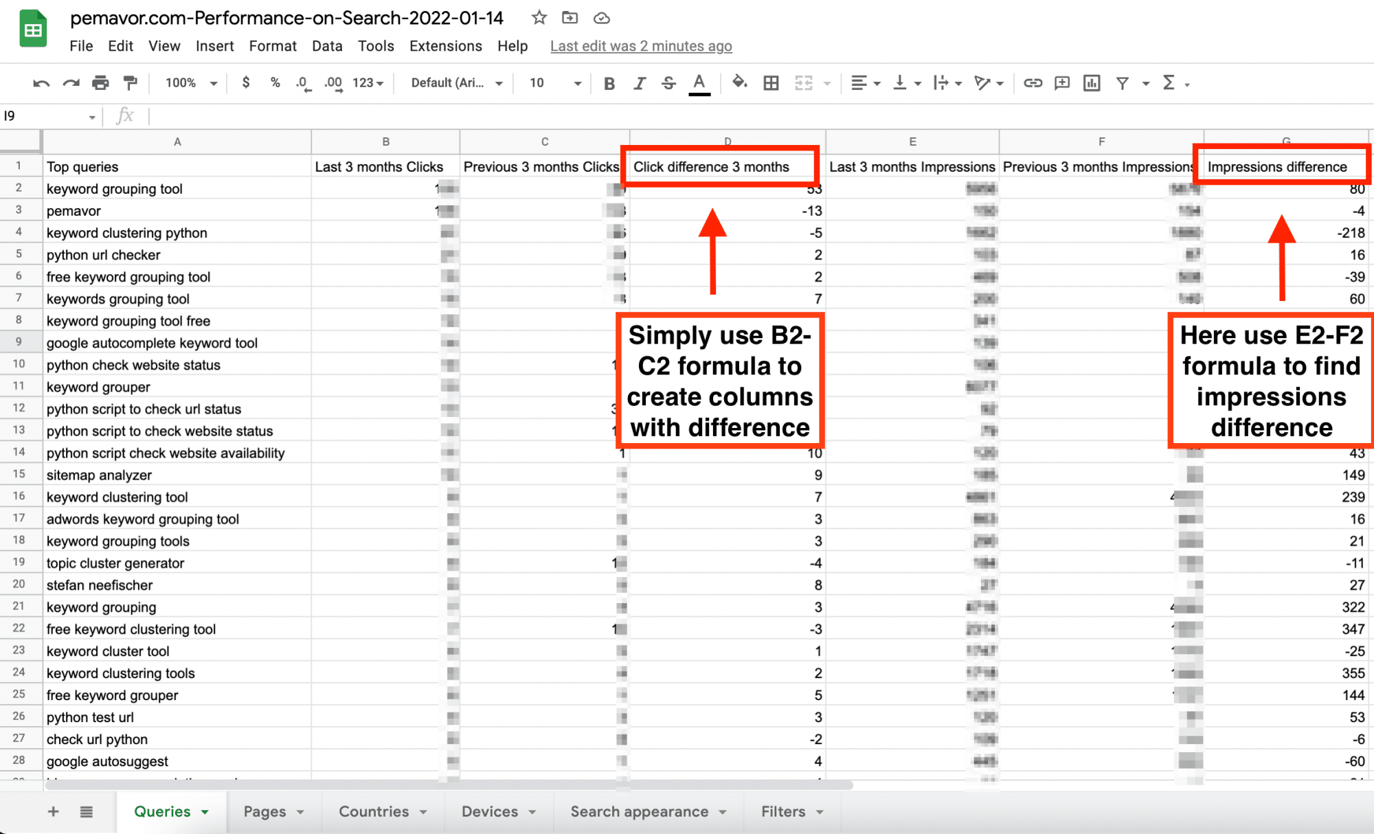
- Now you’ll get a Google Sheet filled with your GSC data. You’ll only need the Queries page, as shown above. Ideally, you can arrange your data further per your need. For instance, we deleted CTR and Position data as we only need query and keyword performance.
Step 3: Paste your data and run the tool
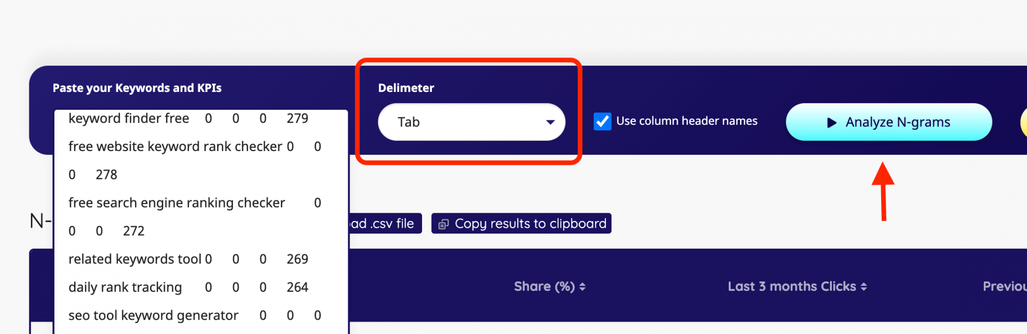
Now, you can run the tool by following the steps on the screenshot above.
- First, paste your data to the left bar, select your Delimeter as Tab, keep the Use Column Header Names option, and click on Analyze N-Grams, then just wait a couple seconds, and you’ll get your n-gram results listed.
Step 4: Analyze or export your winning & losing n-grams
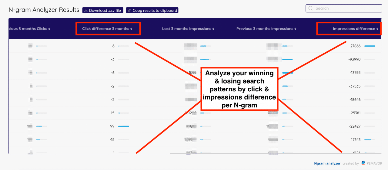
Now, you can see the comparable queries in n-gram format. By clicking on the “arrow” next to each header, simply re-order the list per category stats like clicks and impressions. Or, you can now simply export your n-gram results as .csv file or copy to your clipboard.
On the result sheet, we can easily determine which n-grams & Search Patterns are winning or losing over time. For instance;
- As you see, some of our queries & impressions are considerably winning, while the rest with low volume seem stable or losing a bit.
- This way, you’ll have an overview of which search patterns or n-grams tend to perform better or which ones lose interest and performance over time.
- With this method, you can adapt your content strategy to fill the gaps that occur over time.
With Keyword N-gram Analyzer results, it’s now quite easy to determine winner and loser n-grams by simply making use of your GSC data.