The new Looker Studio promises a more user-friendly interface with a cleaner look. It also promises more features.
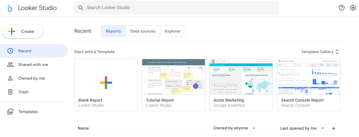
What’s Looker Studio?
As of October 2022, Google’s Looker Studio is the new face of the existing Google Data Studio. You can create dashboards and reports using data from various sources, including spreadsheets, databases, and cloud storage platforms.
Looker Studio is a cloud-based tool and accessible from any web browser, and users can collaborate on projects in real time. It’s suitable for many users, including business analysts, marketeers, and data scientists. In addition, organizations of all sizes use it to visualize and analyze data for various purposes, such as understanding business performance, identifying trends, and making data-driven decisions.
What’s the difference between Looker and Looker Studio?
Google acquired Looker in 2019 and renamed its Data Studio as Looker Studio. Looker is a tool for creating and editing custom data models and exploring data and is part of the Looker data platform. Looker Studio is a free data visualization tool that allows users to create interactive dashboards and reports with data from a variety of sources, including spreadsheets, databases, and cloud storage platforms.
They have similar features, such as the ability to create custom data models and visualize data, but they’re designed for different purposes and have additional features. For example, Looker gears towards data and business analysts who need to create and maintain complex data models. Also, it’s not free, and you should request a quote to get a price that’s suitable for your business. In contrast, Looker Studio is free and more suitable for users who want to create simple dashboards and reports for presentation or communication purposes.
Bringing Looker and Looker Studio together opens up exciting opportunities to combine their strengths and BI (Business Intelligence) and analytics capabilities to help customers reshape their data work.
Benefits of Looker Studio
- Visualization: Looker Studio provides a range of visualization options, including charts, graphs, maps, and tables, so you can explore and understand the data visually.
- Collaboration: Cloud-based Looker Studio enables real-time collaboration on projects, which makes it easy to work with team members and share insights.
- Customizations: Looker Studio allows users to customize dashboards and reports to their specific needs and preferences, including adding logos, changing colors, and editing other branding elements.
- Ease of use: This user-friendly platform allows the creation of dashboards and reports with a simple drag-and-drop interface, so it’s easy to get started without programming knowledge.
- Make data-driven decisions: You can gain insights and make informed decisions based on data, not assumptions or guesswork, by analyzing and visualizing data.
Keep the following in mind when creating dashboards in Looker Studio
- Determine goals: What do you want to achieve with a dashboard? What information do you want to present, and to whom? Clear goals help you determine the most relevant metrics and the best data presentation.
- Choose suitable data sources: Use relevant and reliable data sources. Besides, your data must be accurate and up-to-date so that the dashboard is based on reliable information.
- Choose the right visualization types: Different visualization types are suitable for different data types and goals. Pick the right chart or graph to effectively convey the desired information.
- Make it easy to understand: A dashboard should be simple and easy to understand because users don’t want to be overwhelmed with too much information. Plus, don’t use incomprehensible jargon.
- Make it visually appealing: A well-designed dashboard is more likely to be used and understood. Use colors, fonts, and layout effectively to make a dashboard visually appealing and easy to read.
Common metrics
It’s important to choose metrics that are relevant to your goals, so that you can track progress. Once you have connected a data source, you can create a report in Looker Studio to visualize and analyze a website’s performance. For example, you could make a line chart to see how website traffic has changed over time, or a pie chart to see which pages are most popular. You can filter and parameterize data to drill down into specific parts of the data and see audiences interact with our website.
Metrics you might want to put on a dashboard include
To increase website traffic and engagement:
- Number of website visits
- Pages per visit
- Average visit duration
- Bounce rate
- Traffic sources (e.g., organic search, referral, paid search)
To improve social media engagement:
- Number of followers or fans
- Engagement rate (e.g., likes, comments, shares)
- Social media reach
To measure marketing and advertising effectiveness:
- Cost per acquisition (CPA)
- Return on investment (ROI)
- Cost per click (CPC)
- Click-through rate (CTR)
To improve operational efficiency and productivity:
- Time to complete tasks
- Number of errors or defects
- Cycle time
Why should you use filters in Looker Studio?
By adding filters to your reports, you can better understand your data and make more informed decisions based on it. There are several reasons why you might want to add filters to your report:
Organize your data: Filters can help you organize your data by allowing you to focus on specific subsets. For example, you could use a date range filter to show only the data from the last month, or a dimension filter to show only data from a specific region.
Examine data in more detail: Filters let you explore your data more easily by changing the perspective of the data view. With filters, you can quickly and easily see how different segments of your data are performing and make data-driven decisions.
Compare your input: Filters make it easier to compare different parts of your data. For example, you can use a dimension filter to compare data between different regions, and a date range filter to compare data between different time periods.
Create an interactive dashboard: Filters are an essential part of interactive reports and allow your audience to navigate and drill down into the data they see. Without filters, they have no way to focus on a specific subset of data that interests them.
Get rid of problems: Filters can also fix problems with your data by allowing you to identify and isolate problematic data points.
How might you use filters in your report?
When you add a filter to your Looker Studio report, you can use it to control what data is displayed in the report. Here are some examples of filters you might like to use.
Date Range Filter: Use a date range filter to show only data from a specific time period. This can be useful to focus on a specific time period, such as the last month or year.
Dimension filter: Use a dimension filter to limit the data displayed in your report to a specific subset of a dimension. For example, you could use a dimension filter to display data only for a specific region or category.
Metric filter: Use a metric filter to limit the data displayed in your report to a specific subset of a metric. For example, use a metric filter to display only data for sessions that resulted in a conversion.
Advanced filter: Use an advanced filter to filter your data based on specific conditions. For example, you might want to show data only for countries where the conversion rate is above a certain threshold.
Combine filters: You can also combine filters to limit the data displayed in your report to specific subsets of dimensions and metrics.
When adding filters, be clear about what you want to achieve with the filter and try different filter types and combinations to find the one that works best for you. Remember that you can add, remove, or change the filters you’ve applied to your report at any time, so you can experiment with different filter settings to find what works best.
Unlock the power of GA4 with Looker Studio
GA4 provides a lot of data, but analyzing and understanding can be confusing to others. When you connect GA4 to Looker Studio, you can create visualizations that make it easier to understand and share your data. It enables you to create visualizations that highlight key metrics and dimensions like user engagement, conversion rates, and acquisition sources.
In summary, GA4 and Looker Studio are a dynamic duo to gain a holistic understanding of your business performance. GA4 tracks and analyzes user behavior, while Looker Studio visualizes and presents the data in a clear and actionable way. Together, they provide a comprehensive view of your business performance.
Contact us and discover how we can help.